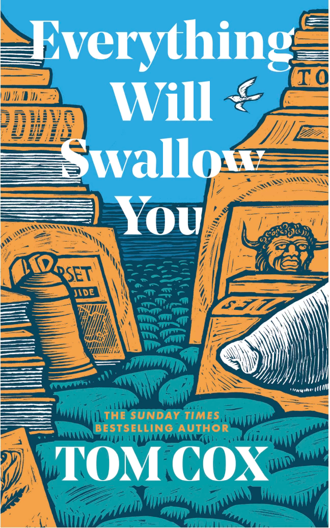
After weeks of tantalising waiting, today I am hugely excited to be able to show you the cover art for my third novel, Everything Will Swallow You…
The cover is the work of the enormously talented Joe McLaren: his fourth for me, so far. I think it perfectly encapsulates the book’s mystery, the dusty objects scattered through the narrative and its coastal Dorset setting, with just a hint of the identity of one of its two main characters. When it was in development, just as a starting point I sent Joe this 1982 Picador cover of the autobiography of John Cowper Powys for inspiration.
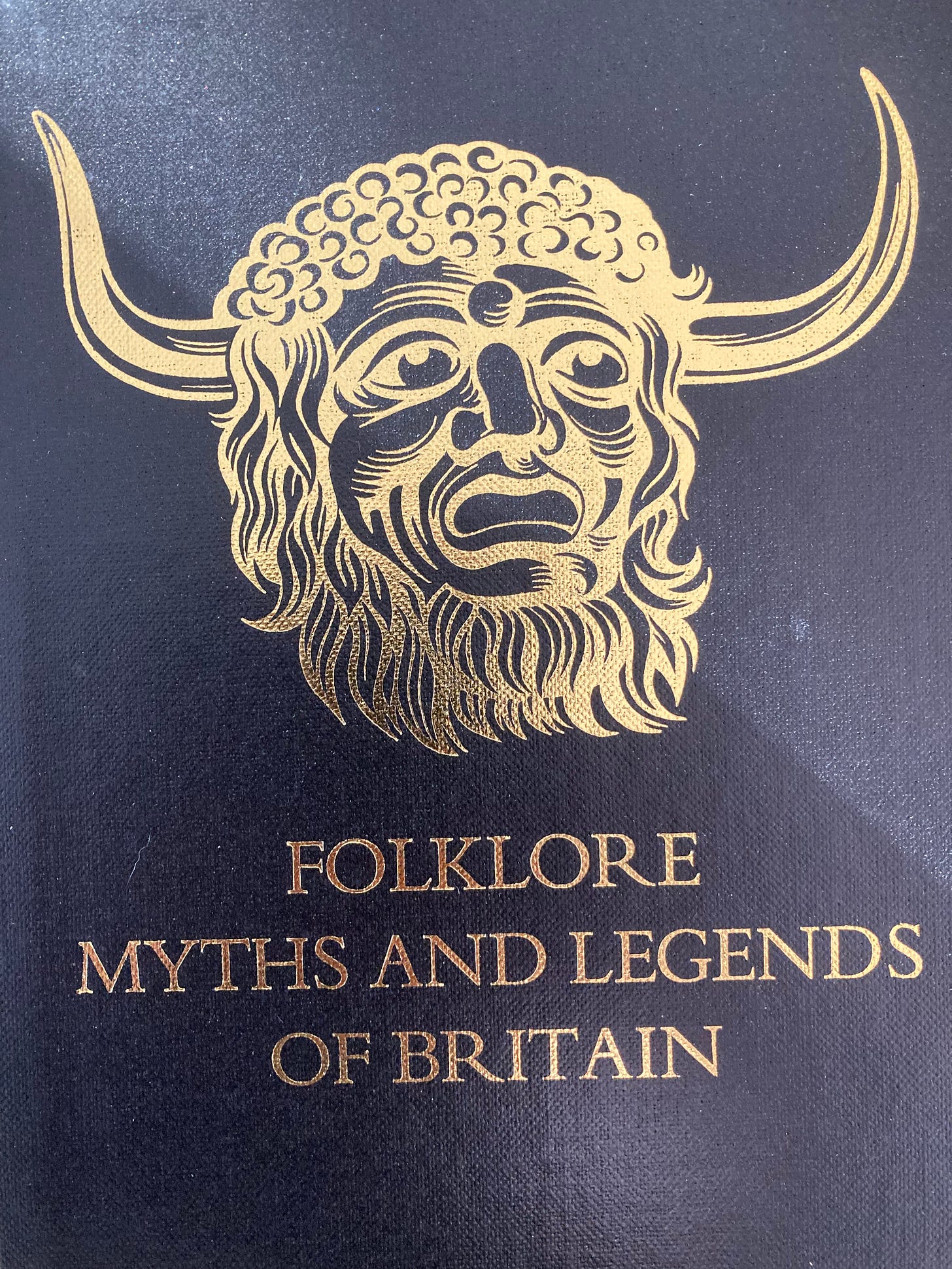
I also made it clear that I was keen to get this character - the Ooser, Dorset’s most infamous folkloric character - on there somewhere, as he plays a not insignificant role in the book…
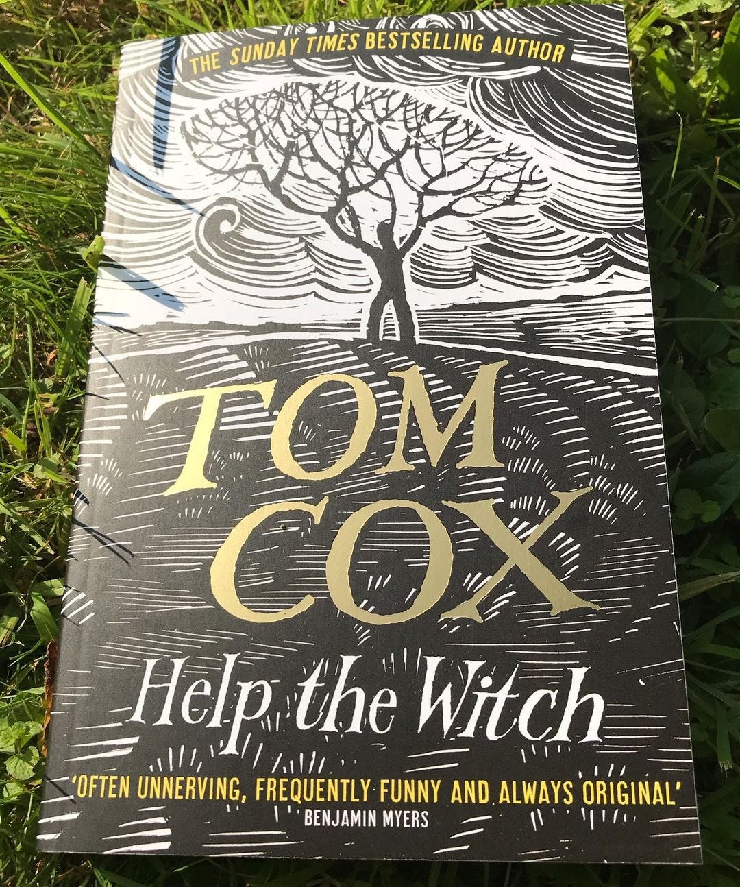
Way back on a cruel, icy day in January, 2018, during the writing of my first short story collection Help The Witch, I was walking the barren landscape of Kinder Scout in The Peak District, wondering what kind of cover might suit the book, and I came across these two inosculated Sycamores, which immediately put me in mind of a branch-handed man, raging at an unjust sky.
I sent the photo to Joe (via my then editor Simon Spanton) and a few weeks later he came up with this…
Seeing what Joe had done with my seed of an idea was a cathartic feeling for me, after a long period of having to fight - often unsuccessfully - to not have utterly terrible covers on my books. The nadir of the earlier phase had come when Simon And Schuster UK decided to put a kitten inside a baseball boot in an attempt to get 2011’s Talk To The Tail - a book less than 50% about cats, which didn’t even feature a kitten - into supermarkets. Like its predecessor - a kitten sitting in some discarded jeans - I have no doubt that this cover alienated a lot of people who might have enjoyed the writing in the book (I mean, I wouldn’t have bought it, and I wrote it!) while drawing in many people who probably wouldn’t. I’m sure both kittens were lovely but fuck knows who they belonged to. I’d never met them and they certainly had no business being on the covers of my books.
None of this was particularly unusual - especially around the beginning of the second decade of this century, just prior to a generally better time for book cover art. No, I had never encountered another author who’d had a publisher try to make their book look like a cheap unattractive birthday card, but - around the time my worst covers were being put out into the world, in the hope of appeasing Tesco - I met a mass market fiction author who had recently dissuaded her publishers from making her adopt a “cuter” pen name and lavishing her debut novel with a cover illustration of a young woman in a woolly hat leaping into the air for glee in her local Starbucks.
In 2013 by moving to Little Brown for my final two “cats and more” books, I was at least able to get my own cats on the covers of the books I’d written about them, but even that necessitated a battle, after they initially shot an actor cat lookalike of my elderly cat The Bear for the cover of 2013’s The Good, The Bad & The Furry. The success of those books also gave my agent the leverage to persuade my previous publishers to rejacket the earlier two books.
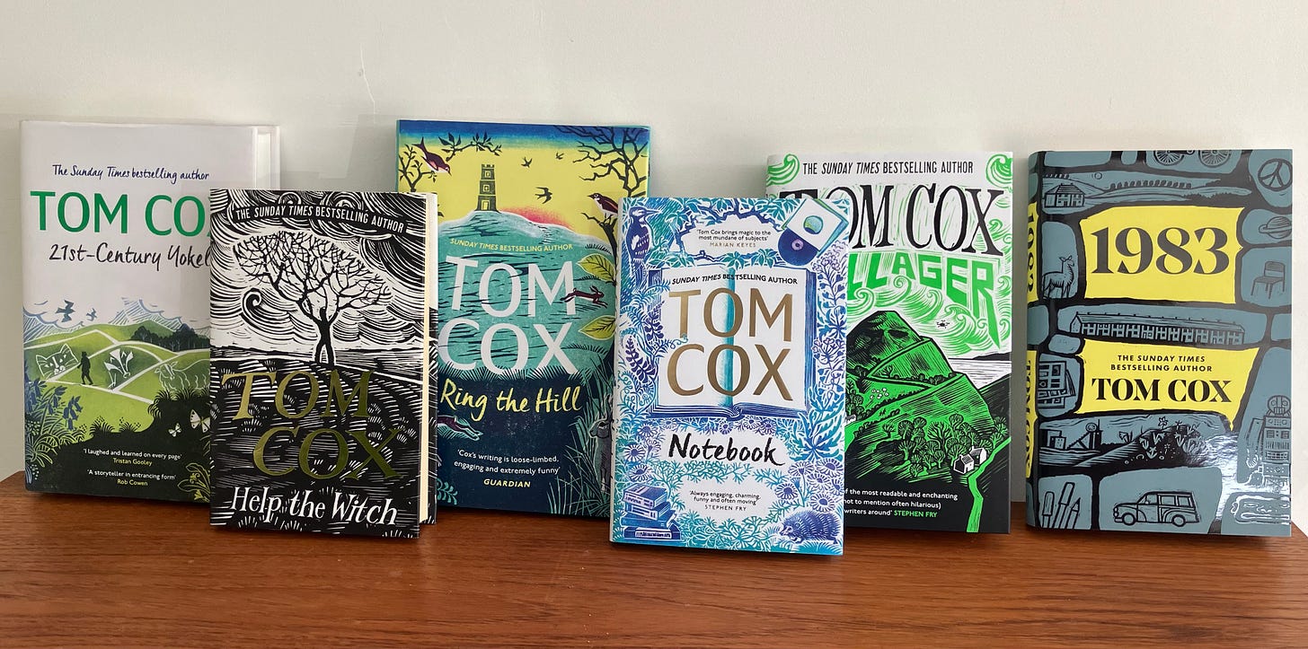
However, when I embarked on my ninth book, 21st-Century Yokel, in 2016, I did so with the feeling that I’d never had a truly great cover on one of my books, nor one that fully summed up what they were about. The covers that Joe and Clare Melinsky - who illustrated the covers 21st-Century Yokel, Ring The Hill and Notebook - have come up with, in collaboration with Mark Ecob of my publishers Unbound, have changed all that.
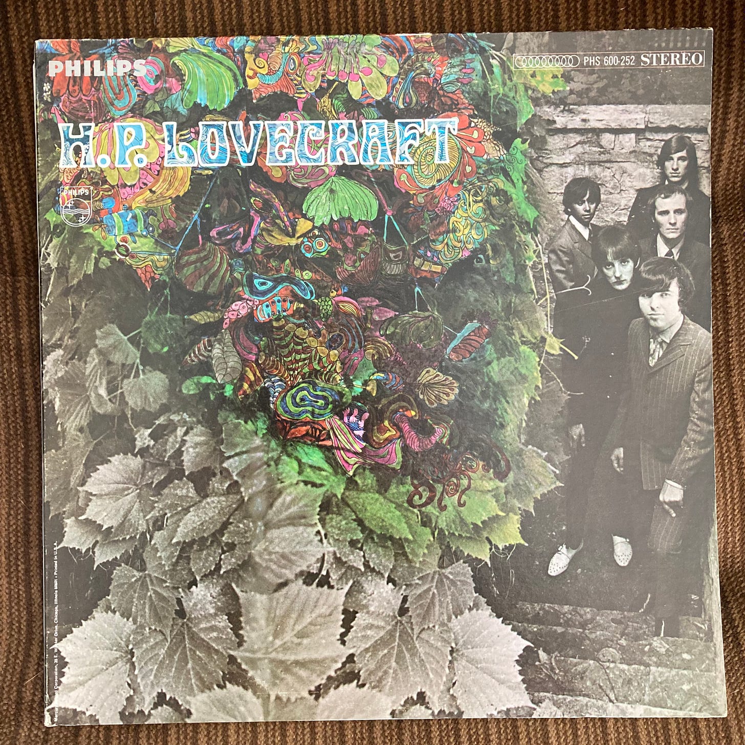
Covers matter. I didn’t buy this 1967 LP by the San Francisco-based psych band HP Lovecraft solely based on its cover, but I would have done, and if I had done, I would have been far from disappointed.
Not all records and books with brilliant covers live up the promise the art on their exterior makes, but a lot do. And that’s because when people go the extra mile with their creativity, and push themselves to new heights, they’re likely to fight that bit harder to make the result something whose every element they can be proud of. I started putting more pride and care into my books in 2016 and, when I did, I realised I needed a publisher who understood what I was really trying to do, not one whose main goal was to make my books sell as many copies as possible in Asda over a short period of time then forget about them. I made sacrifices to go with that publisher, and some elements of publishing with them have been harder than they’d have been if I’d stuck with a traditional mainstream imprint, but there are few things that beat the satisfaction I get when I look at these, lined up together, knowing that another member of their family is soon on the way.
I’ve been keeping Joe particularly busy of late, since Everything Will Swallow You is the second cover he’s illustrated for me in under a year. Last December he came up with this equally wonderful and apt cover for my second novel 1983, which I feel duty bound to let you know is published in the US and Canada TODAY. I’m hoping those of you over there are going to buy lots of copies then, if you don’t hate it, tell all your pals about it (and possibly leave a nice review on a website or two). You can order from Barnes & Noble, Amazon or Bookshop.org or your local independent store. If you are elsewhere in the world, the book is also already out in the UK, and Blackwells will send pretty much everywhere in the world with free delivery. As a taster you can read about the wonderful school which inspired it here.





It was such a joy to me to read this. I am a book cover illustrator, and it honestly leaves me spitting feathers when I see covers which poorly represent the books.
An author pours their heart and soul into a book. It may have taken years of musing and gathering ideas, writing notes and generally macerating, even before the measurable time of writing, which can be years in itself. A good book is like a personality, with a heart, soul and life breathed into it by its parent, the author. The cover is its face - the first thing people see, and the difference between picking it up and turning it over to read the back cover blurb - the book equivalent of striking up a conversation - or just moving on. I see it as the greatest honour (and a rather alarming responsibility), to be the one to give it that face, and the least a cover artist can do is communicate well, read extracts of the book, ask questions if you're unclear, and try to understand what's in the author's vision, then translate it into a form that is, well, visible to other people. I consider mind-reading to be one of the lesser known core skills of an illustrator.
That's the whole point of illustration - the clue's in the name of course, to enlighten or illuminate. I'm not a fan of commercial book cover obfuscations, they do a disservice to everyone concerned.
It's a bit like going on a blind date, but piling on makeup, completely changing your style and putting on a fake persona, to try to appear more conventionally attractive. Ultimately it will only impress people who are after that Kardashian type, and when the makeup comes off and they discover that you actually have a good-natured face full of freckles, and enjoy gardening and talking to your house plants, they will feel cheated and disappointed, and you will feel rejected and misjudged.
I also can't help feeling that if a publisher wants to misrepresent a book to the public in order to get more sales, it's an insult to the author, because they either don't understand the book, or don't have faith in it, and it's a clear message that quick revenue is more important to them than ethics or a meaningful legacy.
I absolutely love your book covers very apt ,colourful and stand out in my book shelf. The best thing as you say is it's what's on the inside that makes it for me a great read and when I re read I find something new. Thank you for taking so much care 💕